[This article was originally published on The Witness Dev Blog in Sept, 2013]
What’s up, internet? I’m Eric – one of the artists working on The Witness. I figured what better way to celebrate more than two years on the project than by making my very first post on the development blog! (plus, Luis and Orsi hassled me!!!) So here goes:
In the olden days of The Witness art development, our visual “style” for the game hadn’t really coalesced yet. Or, to be more accurate, we knew what our objectives were (from a purely theoretical, gameplay-based perspective) but we hadn’t really grasped what the ramifications would be in terms of our production process.
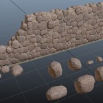
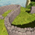
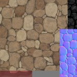
For instance, on an early attempt at adding a rough-stone wall, I approached it like most modern game artists would: using the full spectrum of art tools and tricks… normal mapping, edge-distress, enhanced details, etc..
But the problem with this approach is that it’s sort of at odds with one of our prime directives from Jonathan: to build a game world without unnecessary visual clutter. “Noise” was our enemy. But that’s kind of an interesting riddle, since most game engines and art techniques are so often all about adding extra levels of noise, grime, texture, detail, (realism!), etc.
So we began an exploration of different techniques we could use to achieve a sort of stylized realism. We needed to be able to capture the “essence” of our reference imagery while not being quite so literal. It also had to be free of gratuitous visual noise, plus appealing to look at and explore. So what follows is an early effort to break down and re-think that art process in a different sort of way.
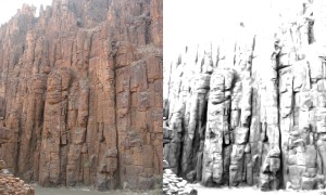
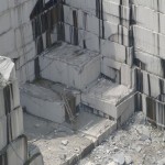
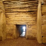
In this case, my objective was to figure out how to attack a medium-sized cliff face while avoiding an overwhelming amount of noise/detail. First off, reference. Starting with some photo reference, I wanted to isolate the primary features, and not worry at all about the small, noisy stuff:
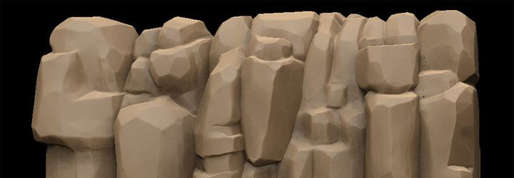
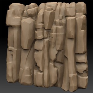
Then, an attempt to stylistically sculpt those simplified shapes:
And finally, breaking those forms down into modularized, reusable meshes that could be combined to form a cliff:
One of the biggest lessons we learned from this experiment was that if we give the engine nice clean, simplified geometry (not worry as much about the texturing – just keep it understated and focus more on the overall color and balance), the lighting results we get are gorgeous. In a way this is extremely freeing, as it lets us concentrate on the overall form of objects, rather than obsess over details like perfect seamless, UV mapping, limited texture resolution, normal mapping issues, etc. We also learned very quickly that hard edges are not evil…. In the absence of heavy texture detail, the faceting had become a powerful tool to help define the form in a clean, almost graphic style, with minimal noise, but lots of subtlety.
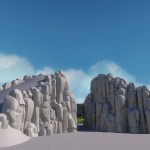
That process of “analyze, deconstruct, simplify” became our new way of approaching complex surfaces. And so, as we built out more areas of the island, this visual language began to take shape,and you can now see it deployed across most of the rock forms in the game…
Take note that foliage has a different language [see Orsi’s previous post on trees], as does rolling terrain, and hard architectural surfaces. But this style contrast is extremely useful from a game design perspective, as it helps inform the player as to what materials the surfaces they are looking at are likely made from, without having to resort to overtly photoreal textures.
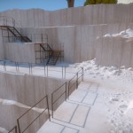
Even older areas of the game (that were suddenly “out of style”) were able to be refreshed using this new lens, and brought in-line alongside the cleaner, less-noisy artwork:
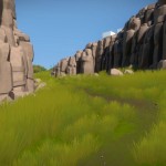
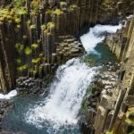
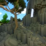
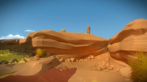
And here’s some additional rock shots from around the island, just because…
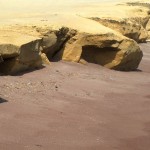
Luis’ awesome sculpted sandstone cliffs:
Orsi’s awesome lakeside steppes:
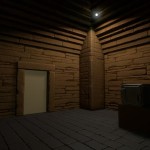
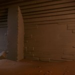
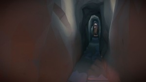
And a bit of mysterious tunnel:
That’s all I’ve got to share for now. Have a great September!!!
-eaa
